By: Gabriel Rodríguez Moh
May 17, 2024
In the world of graphic design, a style guide is a fundamental tool to ensure coherence and consistency in a company's visual communication. But what exactly is a style guide and why is it so important to Acorde International INC?
A style guide is a document that compiles the rules and guidelines that must be followed in the creation of any graphic material for a company. These standards include aspects such as corporate colors, typography, logo, iconography and photography styles, among others. In short, the style guide is like a brand's visual DNA; it establishes a visual standard that must be followed in all company communications. This ensures that all graphic elements used remain uniform and consistent across all brand materials.
But why is it important for Acorde International INC to have a style guide? First of all, a style guide ensures that all the company's graphic materials follow the same visual line, which helps to reinforce the brand identity and create a consistent and recognizable image to customers. This is especially important in a company like ours, which operates internationally and needs to convey a strong and professional image in all the markets in which it is present.
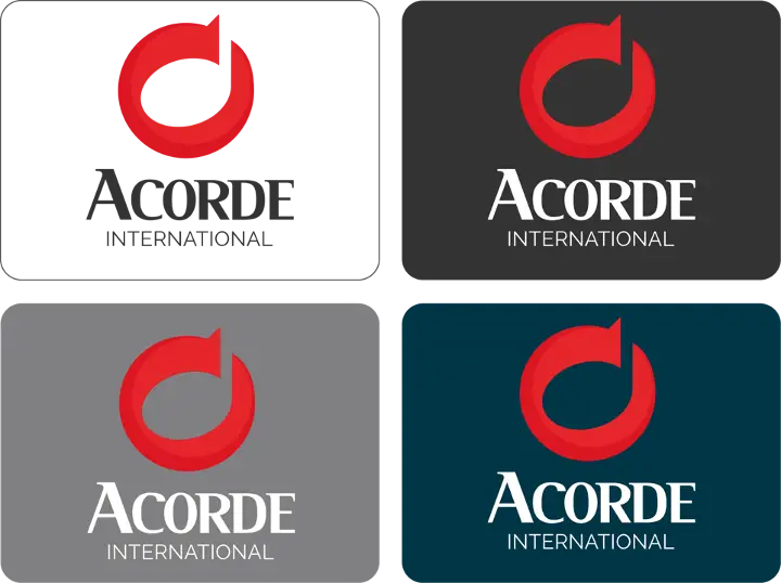
Delving deeper into the content of a style guide, we find that it not only defines the basic visual elements, but also establishes rules for their application in different contexts and formats. For example, Acorde International INC's style guide details how the logo should be used on different color backgrounds, the appropriate scale for different print or digital display sizes, and alternative versions of the logo for use in social networks or mobile applications.
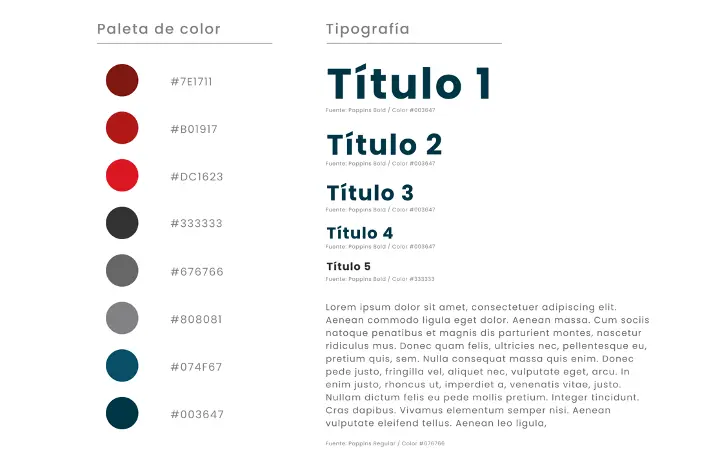
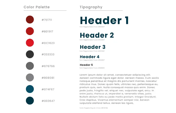
In addition, the style guide specifies the correct use of the corporate color palette, not only in terms of primary and secondary colors, but also in terms of their application in graphics, charts and interactive elements. This is crucial to maintaining a cohesive visual identity, even when working with a variety of media and platforms.
Typography is another key element within the style guide. It is not only about defining corporate fonts, but also about establishing clear typographic hierarchies for titles, subtitles and body text, thus ensuring a pleasant and effective reading experience. The Acorde International INC style guide provides specific examples of how fonts should be combined and in which situations to use each one.

The style guide is not a static document; it is updated periodically to reflect current design trends, ensuring that Acorde International INC remains at the forefront of its visual communication. In addition, practical examples and templates are included to facilitate the implementation of these guidelines in day-to-day creative work.
In short, a style guide brings numerous benefits to Acorde International INC. From ensuring coherence and consistency in visual communication, to facilitating the work of graphic designers and reinforcing the brand image to clients.
Another important benefit of using a style guide is that it helps to build and strengthen the company's visual identity. By maintaining, as mentioned above, a coherent and consistent image in all communications, the brand becomes more recognizable and memorable to the target audience. This helps to build trust and loyalty towards the company.
In short, the style guide is a living tool that evolves along with the brand. Its correct use not only improves efficiency and consistency in the creation of graphic materials, but also strengthens the perception of the brand and its emotional connection with the public. For all these reasons, it is essential that our company has a well-defined and updated style guide, which allows us to continue growing and consolidating ourselves as a leading brand in design and creativity at a global level that supports its main operations of software development and integrations.
In Acorde International INC we know this very well and that is why we have implemented this tool in our design strategy, which has allowed us to maintain a solid and cohesive visual image in all our communication materials. From the design of our website and social networks to the creation of brochures and commercial presentations, we have contributed to position the brand as a professional and reliable company in the market.
In Acorde International INC we are proud to have a style guide that helps us stand out in an increasingly competitive market and is a reflection of our commitment to excellence and innovation in the field of graphic design.